Bicycle network Model – Inner Melbourne
We worked with five adjoining inner Melbourne local governments to create a model that estimates existing levels of cycling and how an enhanced network would impact usage.
Location
Inner Melbourne
Budget
$120,000
Commencement
2019
Completion
2020
Overview
This project, the first of its type in Melbourne, built a network model that estimated cycling levels across all streets and paths in inner Melbourne. It also modelled the impact of a higher quality network on cycling and safety.
About the project
Central to the ambition of growing cycling participation is the need to create a more conducive environment for people to ride bikes.
It is well-established that safety concerns are the primary reason people do not ride a bike. Greater levels of high-quality bicycle infrastructure are required to make cycling a more compelling option.
In seeking to achieve a more conducive environment for cycling, some fundamental questions remained unanswered. These knowledge gaps have hampered efforts to plan future bike infrastructure improvements.
Questions this project answers
- How much cycling takes place on a city’s street and path network now, and how would this change with enhancements to the quality of the bicycle infrastructure network?
- How safe/dangerous is cycling on each street in a city’s network, in total, and on a per kilometre basis, and how might this change with improved infrastructure?
Estimating current cycling levels
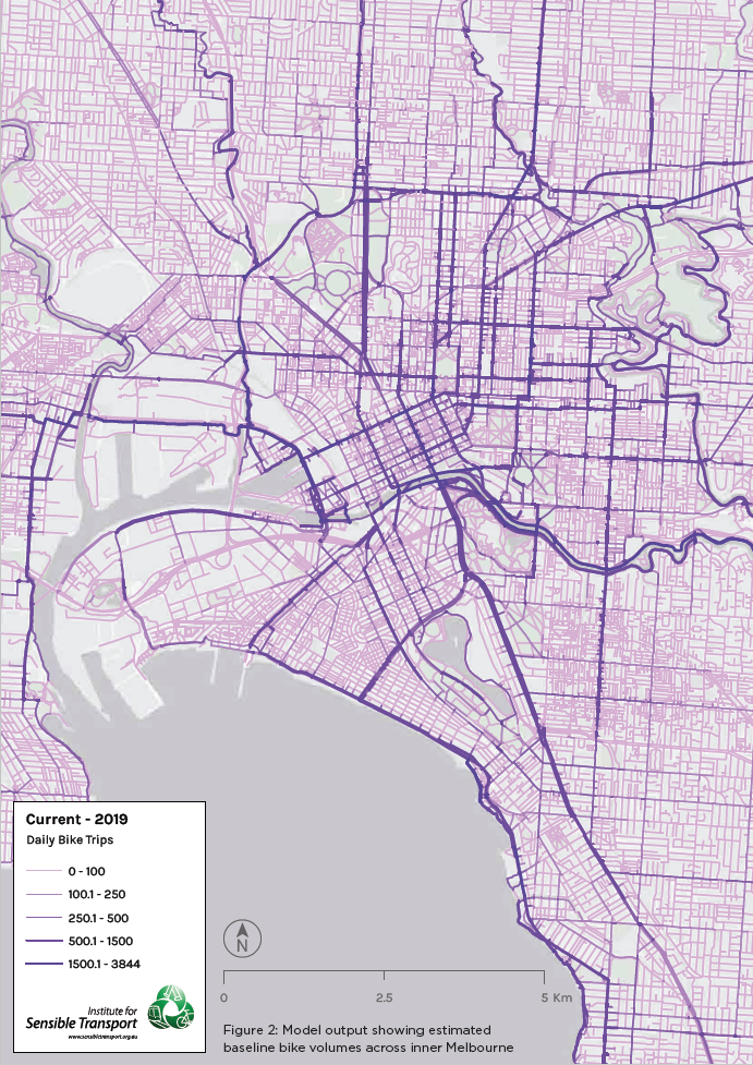
An essential first step in the Model is the development of baseline cycling levels. The map below shows the Model’s output with thicker, darker lines indicating higher estimated cycling volumes. Clients are also provided with a digital version, allowing them to see a clickable map, in which the user is able to zoom in to see estimated volumes for every street in their network. The Model uses a combination of Strava and bicycle count data to create a series of regression models to estimate bicycle volumes. This moderates for the fact that people using Strava are more likely to have recreational rather than transport cycling patterns. Every street and path in the entire inner city of Melbourne has an estimated average number of cycling movements per day, and it is this that provides the baseline data upon which future estimates are modelled.
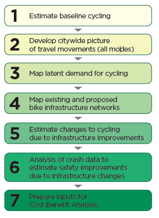
A 7 step approach to modelling future cycling on an expanded network
The Bicycle Network Model can be simplified into seven key steps, as shown in the figure on the left. The primary objective of the Model is to make it easier for government agencies to understand how proposed changes to their bike network will influence ridership and safety, and have a better understanding of which corridors offer the best prospects for enhancing sustainable mobility options. A useful outcome of the Model is that it provides the fundamental inputs to conduct cost-benefit analysis of the proposed network developments.
The Bicycle Network Model creates a Geographic Information Systems (GIS) based tool that can estimate:
- How much cycling takes place on every street within a city’s entire street and path network.
- How enhancements to the bike infrastructure network changes cycling levels on each street, including people diverting from one street to another, to take advantage of improvements to the network on parallel streets.
- The risk of cycling crashes on all streets within a city’s entire street and path network, to provide a clear picture of existing risk profiles (crashes per km), and how this may change via the provision of new infrastructure.
Understanding where existing short car trips start and finish
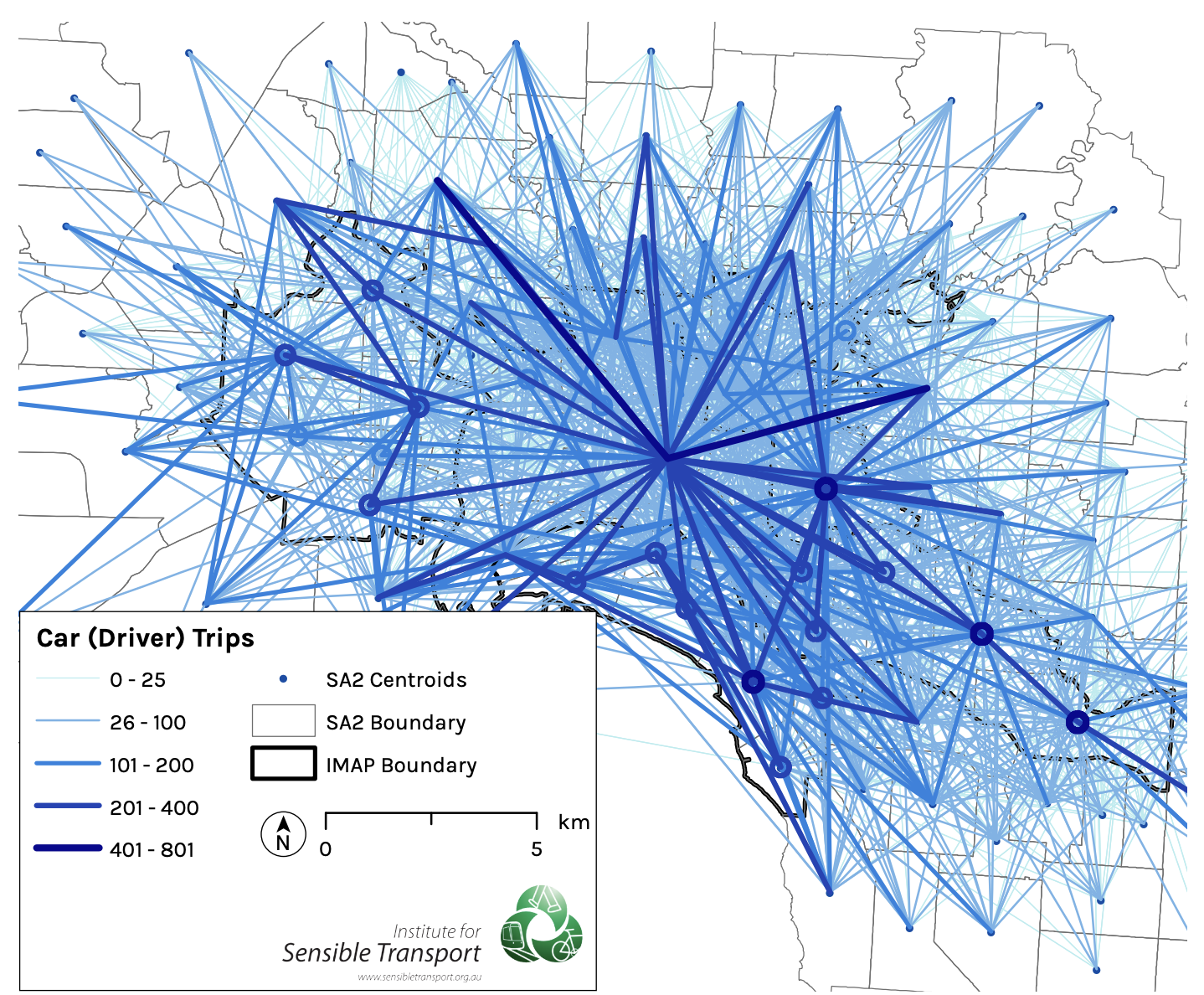
In addition to developing an understanding of current cycling patterns, the Model uses Census data to develop a picture of transport movements across all modes between given origins and destinations. We then assign these movements to the road network. This helps in determining the number of potential new bike riders, depending on the level of new infrastructure proposed.
As an example, the map below shows the graphical distribution of car driver trips between suburbs for trips to work. This is used as a starting point to understand the potential shift towards cycling. The circles that can be seen in the map below indicate trips that start and end within the same suburb, whereas the lines represent trips between different suburbs.
